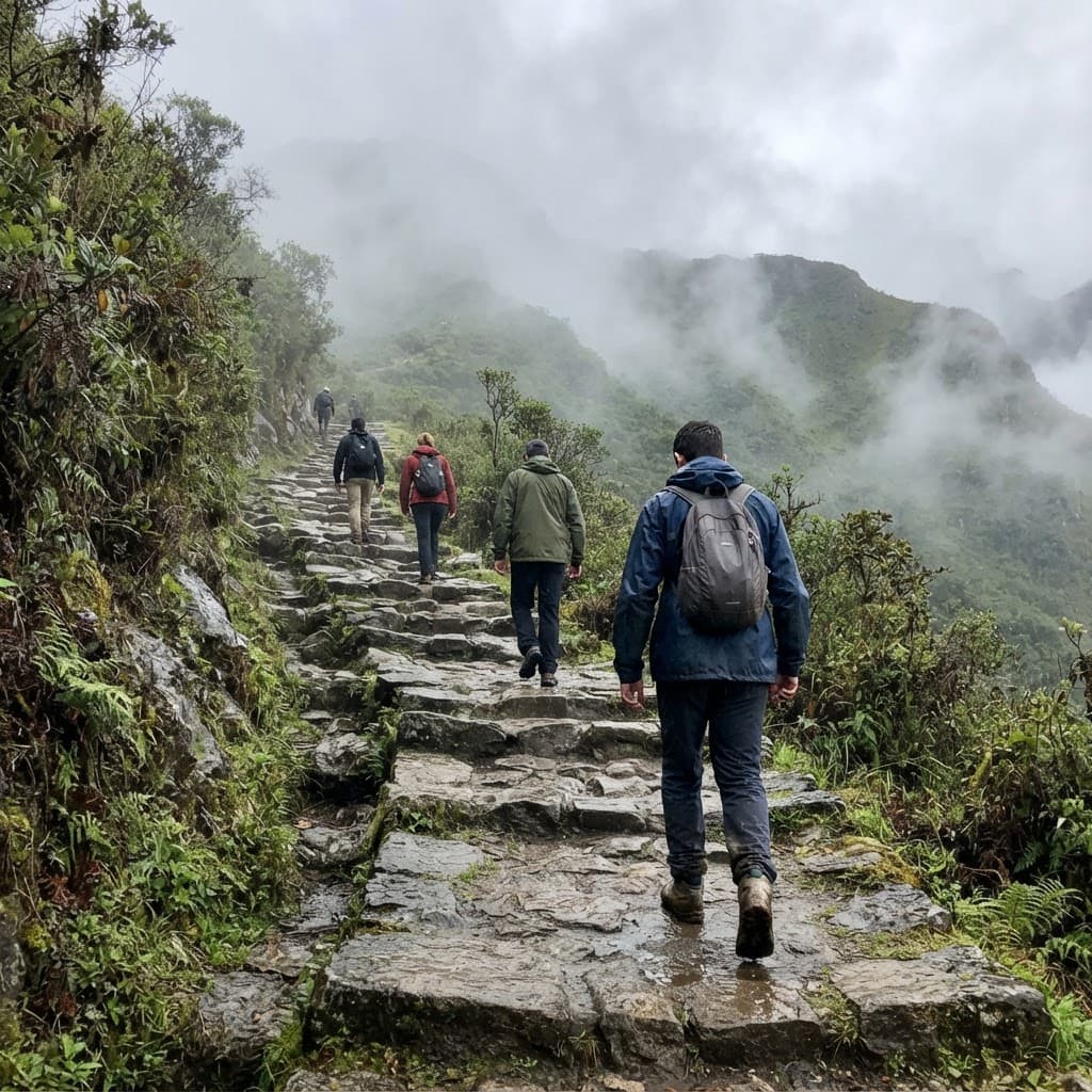
What I set out to do
Finding independent information about the Inca Trail is notoriously difficult. Most search results lead directly to tour operators selling expensive packages with hidden pricing, while helpful planning context remains scattered across dozens of promotional websites. As a Peruvian who has been to Cusco, I can empathize with tourists. I wanted to leverage the domain I own to build a truly unbiased resource.
I built Inca Trail to be the independent planning guide that should exist. The platform bypasses the noise of commercial agencies to provide a completely free, objective mapping tool that helps travelers understand their logistics, estimate real costs, and evaluate local operators before booking.
- Role
- Product designer and builder
- Timeline
- 2026
- Team
- Claude (development and research)
- Status
- Public guide preview with an expanded permit and operator platform is live
01 / ORIGIN
Building a guide, not another sales funnel
Despite spending years visiting Cusco, researching the Inca Trail online still left me deeply frustrated. Most information originated from commercial tour operators selling rigid travel packages, making it incredibly difficult to separate genuine planning guidance from a biased sales pitch. I already owned the domain incatrail.com, and I wanted it to serve a completely different purpose: a free, independent guide that helps travelers thoroughly understand the logistics of the trek before choosing a licensed operator.
That fundamental decision shaped both the final product architecture and the visual direction. The platform does not sell tours, handle permits, or add markups; instead, it directly connects ready-to-book travelers with local operators. I wanted the writing and design to reflect a thoughtful travel journal rather than another commercial brochure. For me, product credibility meant being genuinely helpful without manufacturing unearned authority, which is why I am entirely open about the fact that I have not personally walked the four-day trail myself.
02 / EXPERIENCE
Putting the planning before the booking
Planning the Inca Trail introduces endless logistical questions regarding route selection, seasonal difficulty, and permit requirements. I organized the user experience entirely around answering those questions rather than steering visitors toward an immediate purchase. Travelers can compare eight distinct routes, explore the Classic Trail day by day on an interactive map, and find permit availability in one location. I created a consistent data structure across every single route guide so users can compare metrics without jumping between completely different page layouts.
The interface behaves like a functional field guide, using warm stone colors, clear editorial typography, and documentary-style imagery to anchor the information. During mobile testing, I noticed the elevation chart failed to render properly on smaller viewports. Rather than squeezing the massive data graphic into an unreadable scale, I re-engineered the component to allow smooth horizontal scrolling. The resulting experience makes highly complicated travel information easier to understand without oversimplifying the reality of the journey itself.
03 / DECISIONS
Making trust part of the design
When a user is planning an expensive trip from another continent, inaccurate information becomes a significant risk. During initial design reviews, I caught copy promising unrealistic hourly permit updates, unverified accreditation badges, and statistics that lacked real-world data tracking. I ruthlessly removed these claims rather than letting a polished interface imply technical capabilities we did not possess. I also intentionally kept AI out of the visitor-facing experience; a transparent, deterministic scoring system was far more appropriate for the high-stakes decisions travelers need to make.
I applied this same rigorous truthfulness to the content and the development workflow. Each itinerary is thoroughly researched against multiple sources, and when operator schedules differ, the guide acknowledges those variances instead of presenting a single answer as definitive. To preserve these critical design decisions across distributed engineering sessions, I fully documented the design system patterns and acceptance criteria. This framework prevented code iterations from constantly reinterpreting established rules, while a final milestone audit successfully resolved nine critical accessibility and mobile usability bugs before launch.
From idea to production, with AI as a collaborator.
I partner with AI across the product lifecycle as a rigorous collaborator. I expect models to challenge my decisions and expose trade-offs, not simply agree with me. While independent agents accelerate our build and verification loops, human governance remains absolute. AI creates massive operational velocity, and my responsibility is ensuring that speed moves the product in the right direction.
Discover
Understand the problem
01 /Step 1: Frame the idea
Problem, audience, desired outcome
02 /Step 2: Explore together
Questions, alternatives, tradeoffs
03 /Step 3: Validate assumptions
Research, feasibility, evidence (AI research - I decide)


Define
Set the direction
04 /Step 4: Define the product
Requirements and success criteria
05 /Step 5: Plan the work
Milestones, tasks, acceptance tests. AI drafts
06 /Step 6: Approve the plan
I revise scope before work begins. My approval.
Deliver
Build, verify, release
07 /Step 7: Build + review loop
Implement, agent audit, fix, recheck (AI and agents)
08 /Step 8: Connect + test
Services, env setup, staging QA
09 /Step 9: Ship + learn
I approve release; we iterate. My approval
If you’re interested in working with me, please contact sincerelyjorge@gmail.com.
Have we met? Let’s connect on LinkedIn. Lurking? See you on X. Either way, thank you for stopping by.